
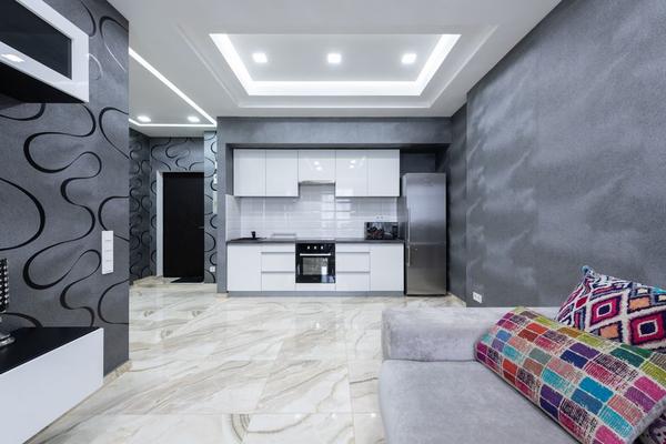
Kitchen design has spent years concentrating attention at eye level: cabinet colours, stone worktops, splashbacks and statement lighting. In 2026, the gaze is moving upward. The ceiling is increasingly being treated as a genuine design surface rather than a white lid over the room, and the most playful version of that shift borrows from circus tents. Stripes, radiating bands of colour and unexpected painted details can turn the so-called fifth wall into the feature that gives a familiar kitchen its personality.
The appeal fits a wider move toward warmer, more individual kitchens. A ceiling treatment adds character without requiring every cabinet or surface to become visually loud. Among the statement kitchen ceiling design trends worth watching, striped and circus-inspired looks stand out because they can feel theatrical, graphic or surprisingly refined depending on the palette.
Why the kitchen ceiling is becoming part of the design
A ceiling occupies a large uninterrupted area, yet it is often the least considered surface in a kitchen. Giving it colour or pattern changes how the whole room reads. A deep ceiling can make a large kitchen feel more intimate, a pale tinted ceiling can soften bright white walls, and a carefully planned pattern can draw attention toward an island, dining table or architectural feature.
Statement ceiling design also works well in kitchens that already feel finished. Instead of replacing cabinetry, a homeowner can add a new layer of character above it, especially where cupboards stop below the ceiling and leave enough open surface for the treatment to register.
The striped ceiling trend brings circus energy without the costume
Growing interest in circus-inspired interiors has helped put striped ceilings into the 2026 conversation. The literal reference is the big top: bands of colour meeting or radiating across the ceiling to create movement overhead. In a kitchen, however, the idea does not need red-and-white carnival stripes. Muted sage and cream, terracotta and blush, blue and off-white, or two tones of the same colour can produce a more architectural result.
Direction matters. Long parallel bands can lead the eye through a galley kitchen or toward doors. Stripes that radiate from a central pendant create a stronger focal point, which can suit a kitchen-diner. Wider bands usually feel calmer than narrow ones, while high contrast makes the pattern more energetic.
How to make stripes feel intentional
Start with something already present in the room. Pull one stripe colour from the cabinetry, floor, stone veining or upholstery, then pair it with a quieter companion. Repeating the ceiling colour once more at a lower level, perhaps on bar stools or a painted door, helps the whole scheme feel deliberately composed.
For example, imagine a kitchen with warm oak cabinets, cream walls and a dark green island. Cream and softened green ceiling stripes running across the width of the room would add personality while tying directly into the island. Simple pendant fittings would let the ceiling remain the main graphic feature.
Painted ceilings can make a statement without stripes
The painted ceiling trend is broader than circus-inspired pattern. A single saturated colour can be just as effective, particularly in kitchens with good natural light. Deep blue, olive, chocolate brown and earthy terracotta can create a cocooning effect, while butter yellow, dusty pink or pale blue can add warmth without making the room feel heavy.
Colour drenching is another option. Taking the wall colour onto the ceiling removes the sharp break created by a white ceiling and can make the room feel more enveloping. In a larger kitchen-diner, a darker ceiling can also help define the cooking or dining area without adding a physical divider.
Other kitchen ceiling ideas for a stronger fifth wall
Paint is the most accessible route, but it is not the only one. Timber cladding can introduce warmth and texture. Decorative plaster or limewash-like finishes create subtle movement without a hard pattern. Wallpaper can work in suitable conditions when the product and adhesive are appropriate for the space, although kitchens with heavy steam or poor ventilation need extra caution.
Architectural details deserve attention too. Beams can be stained or painted in contrast, while coffered ceilings can use inset colours to emphasise their geometry. Even a simple perimeter band can frame the ceiling for homeowners who like stripes but do not want the whole surface patterned.
Match the ceiling treatment to the room
For low ceilings
Low rooms usually benefit from controlled contrast. A high-contrast pattern can make the ceiling feel busier and more immediate, while pale stripes, closely related tones or a wall-and-ceiling colour treatment create a gentler result. Flush or compact lighting also keeps the surface visually clear.
For tall or open-plan kitchens
Higher ceilings can comfortably take stronger colour and broader pattern. Dramatic radiating stripes, darker paint or timber can help bring the room back to a human scale. In an open-plan layout, changing the ceiling treatment above the kitchen or dining zone can create subtle visual zoning while keeping sightlines open.
Plan the finish before the first tin of paint opens
Test colours overhead rather than choosing from a small swatch held vertically, because natural and artificial light hit the ceiling differently. Map stripe widths with removable tape, check where lines meet cabinets and walls, and decide how the pattern interacts with downlights, extractor ducts or pendants. Repair cracks and uneven patches first, because graphic paint tends to highlight imperfections.
A quick mock-up can prevent a repaint. Photograph the kitchen and mark broad coloured bands over the image, or temporarily position paper strips on the ceiling. The goal is to judge scale, contrast and direction before doing the work overhead.
Frequently asked questions
Are statement kitchen ceilings suitable for small kitchens?
Yes. Small kitchens can handle a statement ceiling when scale and contrast are considered carefully. Softer colours, wider stripes or a single painted shade often feel less crowded than a dense, high-contrast pattern.
Do striped ceilings make a kitchen look smaller?
Not necessarily. Stripe direction, width and colour contrast influence the effect. Long bands can guide the eye through a room, while a low ceiling may feel calmer with subtle tonal stripes.
What colour should a kitchen ceiling be?
A reliable approach is to repeat or soften a colour already used in the cabinets, island, flooring or adjacent room. This creates connection and makes the ceiling feel integrated rather than added as an afterthought.
Is a statement ceiling likely to date quickly?
Highly specific novelty motifs may date faster than well-connected colour and geometry. If longevity matters, use a palette that relates to permanent materials in the kitchen and choose a pattern you genuinely enjoy rather than copying a trend at its most extreme.
Give the fifth wall a reason to be noticed
The best statement ceilings are not bold simply to be different. They respond to the proportions, colours and focal points already in the kitchen. Stripes bring the playful 2026 circus influence into the room, but they can be sophisticated when the palette is restrained and the geometry is deliberate. Whether the final choice is a striped canopy, a rich block of colour or a quieter textured finish, looking up can reveal one of the most underused opportunities in kitchen design.